Hey there, fellow Lander!
It’s been a while since we’ve crashed through this blog shedding some light on the neat features we’ve been secretly cooking up at Landing.jobs.
Sometimes you just have to slow down the pace, get your thinking hat and let ideas cook. We make things for people; and since these people are very different from us, we need to care about their needs and do our best to understand them.
As the market rapidly shifts from being driven by companies to one fiercely driven by candidates, tech professionals aren’t just zeroing onto their next gig. They’re searching for that shiny yellow brick road that can lead them to a successful career.
Better management of your career doesn’t just make your life easier — it leads to better outcomes for your projects and personal growth. That’s why we’re excited to share that our candidate vision for the future is to provide you with the right tools, insights and opportunities to continuously grow your career.
This new release brings improvements to the overall experience, a new candidate dashboard, a market insights tool and a couple more of grandma’s special ingredients. Remaining faithful to our film addiction, we’re dubbing this one “Forrest Gump”. It has been a hell of a marathon so far but just like Forrest, we’ll keep running until we’re sure you’ve found your — insert colour here — brick road.
Well, with no further ado and with the drumroll and cue music in place, we are proud to set the spotlight on the features we’ve rolled out and how you can best take advantage of them!
TL;DR > New Features:
Candidate Dashboard
Introducing the brand new Dashboard page, a simpler way to keep track of your applications and recommendations, check out brand new jobs picked for you or simply manage your subscriptions.
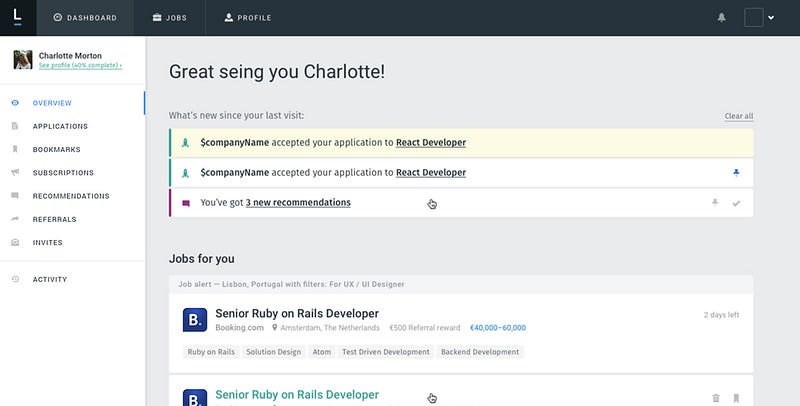
Want to know what you should check first when you land on our platform? The new dashboard isn’t just a huge leap in user interface and experience; it was designed from scratch to show more of what you can do instead of simply waiting for you to do it. Pragmatism, not idealism!
Quick Access Sidebar: A brand new left sidebar allows you to take advantage of our candidate features in a simpler and more accessible way.
Subscriptions: You can now check out your most recent job matches and also follow companies you love. Make sure to have a look and create a subscription, so you receive alerts when new job offers of your interest are posted.
Growth Tasks: In the overview page, and still under development, a neat checklist will give you insightful and actionable suggestions of what you should do to get the most value out of Landing.jobs and start exercising your career muscles in the process. We’re committed to helping you grow, not just find you a job.
Jobs for you: Still on the overview page, you’ll notice that we now have a handful of Landing-picked jobs for you. It’s pretty straightforward: fill in some of your profile info, namely skills and preferences, and we’ll leverage your subscriptions and profile data to show you all the new opportunities that are a good match. You can also dismiss offers. Knowing what you like or not will help us out narrow down the job that best fits you.
Market Insights
The demand for highly qualified tech professional is growing as fast as never before, so you better bring out the big guns. Tech is, by nature, a very fast paced environment to thrive in and at Landing.jobs we’re always doing our best to make sure you have valuable resources that can give you the upper hand.
You might remember YourFit, our framework that helps job-seekers analyse and assess job opportunities, along with their current professional situation.
Following up on that lead we recently launched a Salary Calculator to help you understand the breakdown of salaries around Europe a bit better. Drop by and try it out.
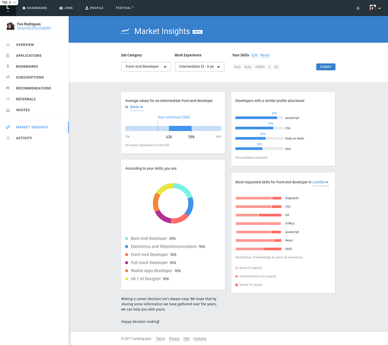
The most recent addition to the family is the Market Insights tool. While the former tools focus is Jobs & Candidates, this new one sheds some light on the major market trends and benchmarks it against your profile. It’s a simple, yet powerful way of getting a glimpse of the most sought out skills in your city right now and where your peers are investing their time.
Block by block we’ll keep adding tools and resources that can enable your career growth. Stay tuned.
Homepage
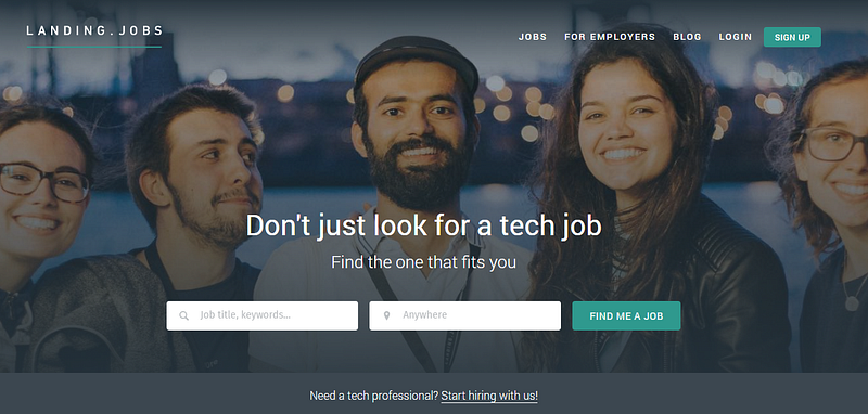
It might have gone a bit unnoticed but a couple of months ago we decided to revamp our homepage. There were two core principles behind this initiative:
- We want to make sure you get value out of us first and only after asking for something in return;
- Show in context, not tell in general. Good design is about making the world simpler, not simple. Let’s drop those awful web pages full of blocks of text that eventually no one reads and instead go for the right amount of information within the right context.
With these two principles in mind, we decided to test the following assumption: “anyone that lands on our homepage is searching for jobs”. We made sure that you have a guided search instead of an open one that could lead to unsatisfying and frustrating results.
Every part of this page should remove some of the burden and anxiety of making you decide and/or go for a broader open query to search our job listings. You can now search offers on:
- Our curated job listings
- Our city guides (e.g. Lisbon and Berlin)
- Our brand new companies page where you can follow brands you love.
Dive right into what you’ve come here to do: search jobs, know the market or simply roam around. We’ve just scratched the surface and there’s still a lot to do. Stay tuned for some cool updates in the upcoming weeks — spoiler alert: jobs to be done are coming.
Jobs page
For us, the job listings page works as an extension of the homepage and of the candidate dashboard itself. You should only end up here if:
- Your profile and subscriptions are not giving you proper job suggestions directly on your dashboard or email;
- You’re a non-signed up user testing the waters and looking around for the type of opportunities we have;
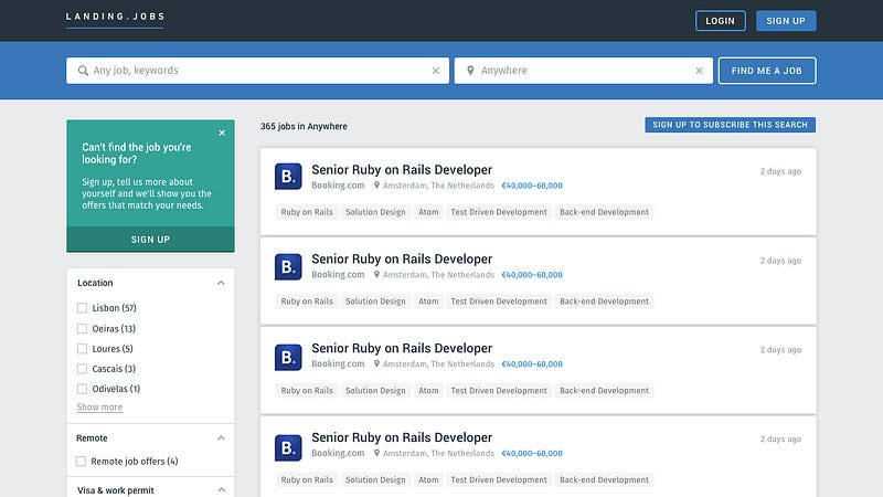
This is one of our core pages and users were having a hard time understanding how to filter jobs and even missing out on some of the filters in there due to hidden layers of fields.
We changed it for a faceted navigation approach that can make all the filtering parameters more obvious to the user and easily accessible. It’s still not live but give it a couple more weeks and this baby is ready to hit the road. Meanwhile, take a look at how it will look like:
What’s Next
Still going at it Forrest? What a run!
After the long post, let me tell you just a bit more about the tracks we’ll be racing:
- A new onboarding flow which applies the “Jobs To Be Done” framework and aims to improve your experience from the first moment you land on our homepage;
- A new company page with more insightful content about the working culture, projects and teams of the best employers working with us;
- Dashboard improvements with growth tasks for your next professional move. Don’t forget: your career is a road permanently under construction! Never stop growing.
- Keep working on the general platform experience and above everything: career growth initiatives!
Just before we go back to the tracks, I want to give a big shoutout to the amazing team bringing these great features to you: @moreira, @gustavo, @mafalda, @pdfrod and @margarida. If you like what we’re doing, let ’em know!
And if you have any comments, thoughts or feedback on our next steps, leave them in the comment box below or send me an email. I’ll always reply — [email protected].
Keep fit! See you in a few weeks.
Love,
Tiago
Head of Product @Landing.jobs




0 Comments